
Medical Tattoo - Clinical Trial App
A collaboration between me, my special projects team at SmartCosmos, and a new medical technology company called CIT based out of New York. Their vision was to replace the wristbands you get while doing a stay at a hospital with a temporary tattoo that would go on your skin that has an embedded NFC chip. This chip would contain the patient's medical records and anything relevant to the medical personnel who would be servicing the patient. A companion app would release in stages, first to the nurses, then the doctors and hospital administrators, then finally the patients themselves with a patient-sided version of the app to get them more involved in their treatment. This was all done to also potentially influence HCAP scores upon which hospitals are graded on. Having a good HCAP score means more government subsidy for the year.
PLEASE MAKE NOTE THAT I AM UNDER AN NDA FOR THIS PROJECT AND CAN ONLY SHOW LIMITED AMOUNTS OF THE EARLY CONTENT.
Project Scope
Rolling out a companion app with many different facets to it is a large undertaking. However, it was decided between the higher ups at SmartCosmos and CIT, that a timeline would be established and the full app would be rolled out in stages. For my time at SmartCosmos, I only was involved in the early beginnings. This includes research, a userflow for stage 1, and a prototype for clinical trial testing. Unfortunately, my sketches for this part of the project were misplaced.
Challenges
A large portion of the challenge from this project comes from the fact me and my team did not have much experience in the medical field. Each hospital goes about things in slightly different ways. We had to do a ton of preliminary research into the daily routines of the potential users of this companion app. This includes the nurses, doctors, hopital administrators, and finally the patients. We were also unsure if people would be ok with the idea of a temporary tattoo on their body, and then on top of that, one with a chip embedded in it. A lot of people out there get freaky when they think about the idea of "computer chips" being put on their skin.
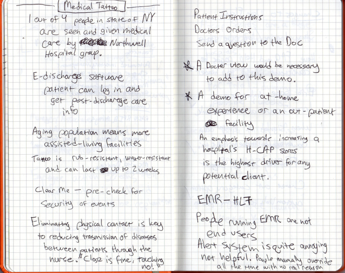
Research and Notes
For the first 3 weeks of the project we did nothing but research, make phone calls, travel to actual hospitals, and have meetings with CIT employees who had specific input about the logistics of the companion app. The pictures below showcase some of the notes and research I uncovered as me and my team went through this process to learning as much as we could about the medical environment. It was particularly helpful when we had a meeting with a group of 6 nurses who were really eager to give their input about such and app. Their feedback was extremely helpful as it formed the base upon which we built our entire nurse side of the app.


Userflow + Low Fidelity Wireframes
While basic, this userflow represents the entire scope of what the initial clinical trial was testing. It was only to see if nurses would be ok with the idea of scanning the tattoos on patients and also to test the accuracy and reliability of the tags in the tattoos in real world conditions. Since human testing is strictly controlled, this userflow, along with all the other design plans for the app were submitted to the Internal Review Board (IRB) which is a government organization that controls how products and procedures are tested and whether or not they are deemed acceptable for use in the real world. The basic flow was to have the nurse login and read the tag. If successful, you would get a success confirmation and a data log entry would generate. If the read was not successful, a retry screen would generate. If the second try failed then the read would be logged as a failure. Finally, if the nurses thought of something while using the app, they could submit feedback withing the app for our review later.
App Prototype
These screenshots are from the app prototype that was submitted to the IRB and then later approved for real world testing on live humans. There was no specific art direction given at the time as this was to purely test the functionality. I went with something simple, not busy, and friendly looking.


