Core.com - Personal UI/UX Project
An experimental proof of concept website for tech-savvy outdoors people. The project was to develop simple templates for specific pages of the site that could be changed and modified at will for other potential website building clients. This was to help lessen the amount of custom work needed as I would build a website or web app solution for future clients.
Project Scope
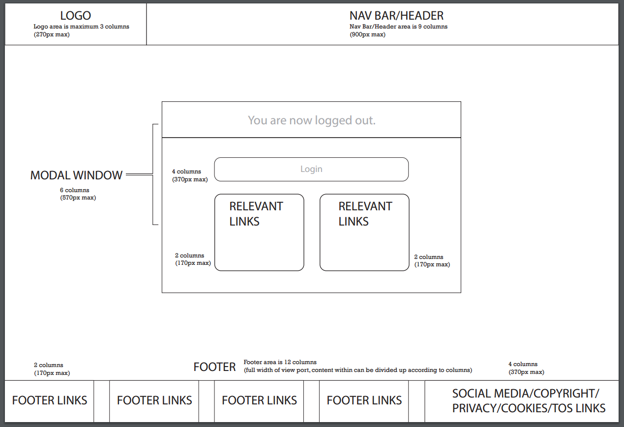
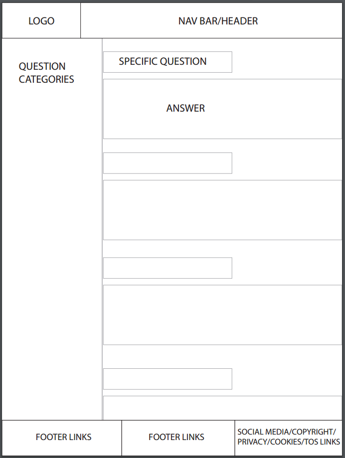
I tasked myself with researching, sketching, and then designing a series of six low-fidelity templates which would cover the login, logout, 404, FAQ, help center, and profile pages. These would cover the desktop, tablet, and phone platforms. The content could be arranged in any manner I saw fit as long as it facilitated ease of use and simplicity. However, I was not allowed to touch the header and footer as the content in them was set in stone.
Challenges
I was gave myself a basic set of expectations but no other direction on where to take the design of these pages. Designing new content while not having any specific places to start from can sometimes be challenging as you must spend time researching what will work the best, what you think looks best, and then a happy medium between the two that satisfies the project scope. I gave myself a 2 day turnover time so as to keep this personal project realistic to real-world expectations in previous workplaces.
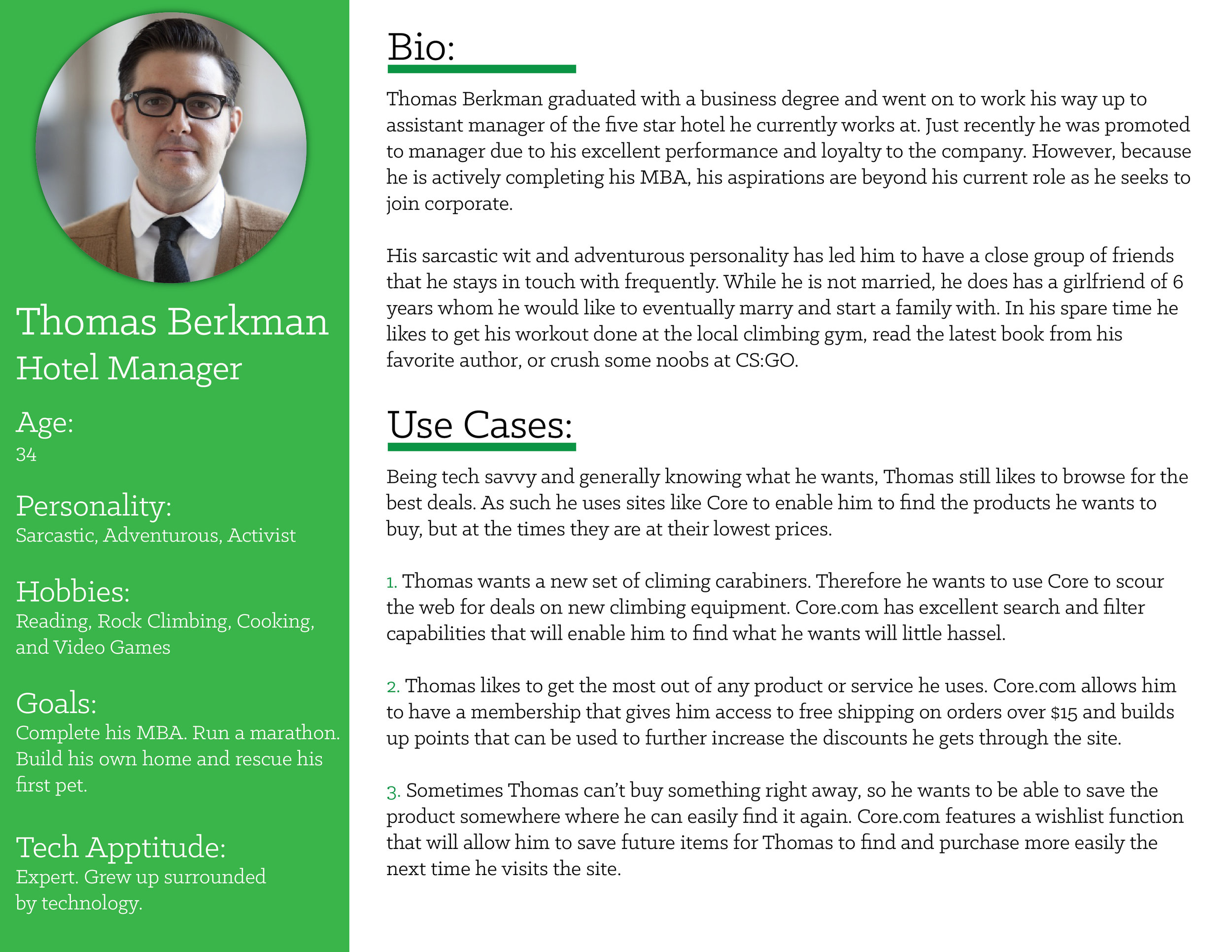
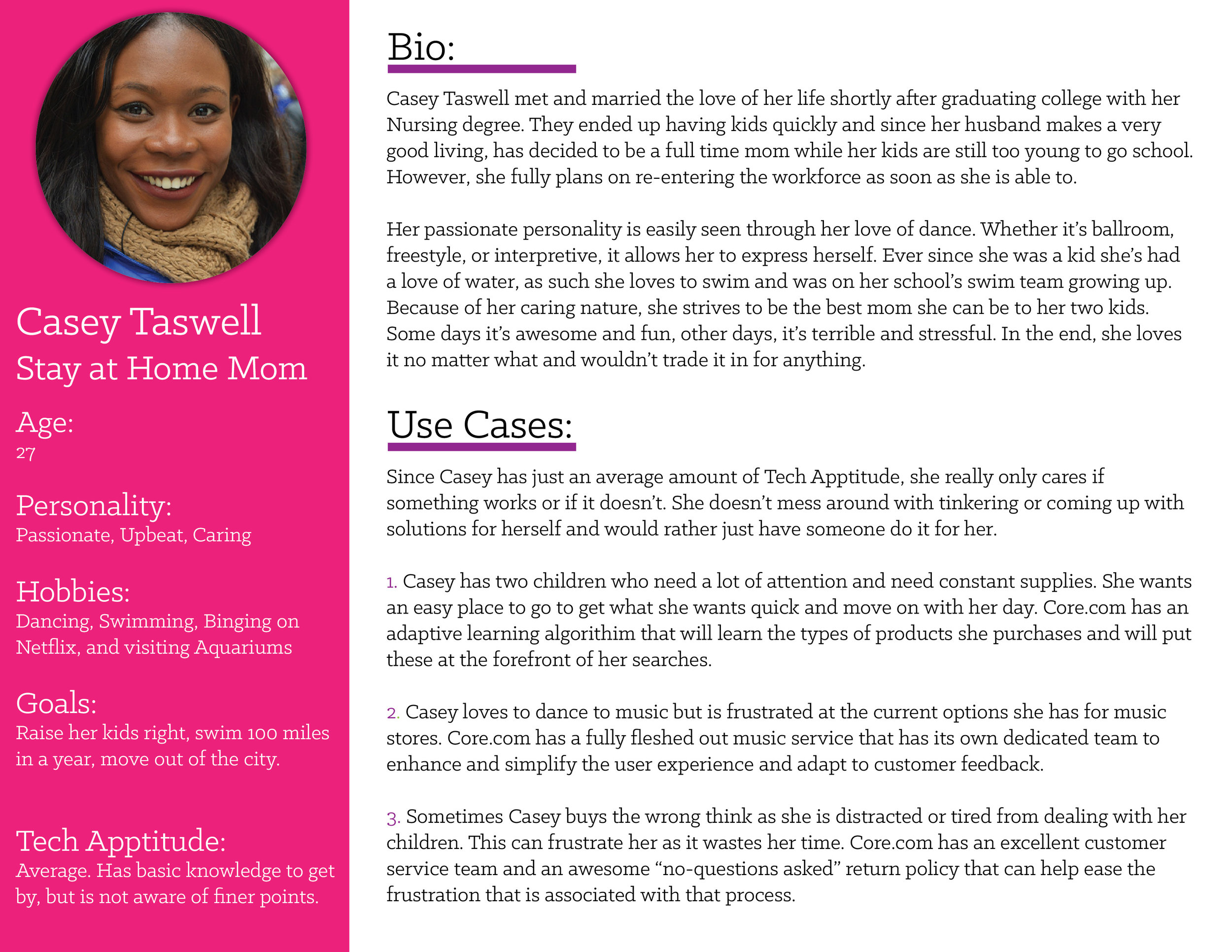
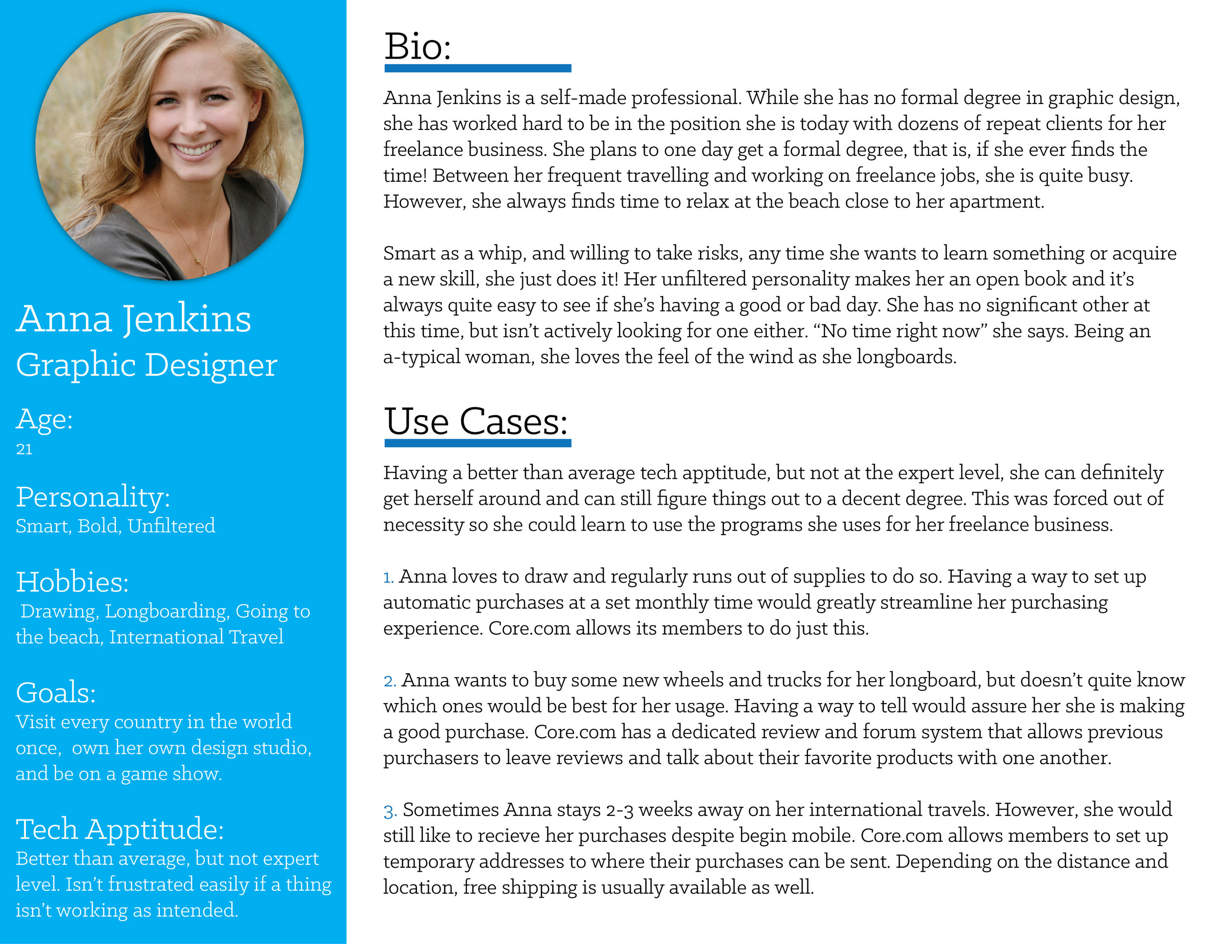
Persona Development
To even know where to begin on this project, I felt it prudent to get into the mindset of people who might potentially use this. After exploring three different options, I felt I had a good enough idea of how to proceed. This persona creation helped me think of usability issues I would not have otherwise.
Sketches
Sketching is a great tool to use when exploring content layouts and getting all your ideas down on paper! Having a base plan to follow as you create in a digital space cuts down on time and allows you to quickly see if an idea is worth pursuing. I ended up producing 3 versions of each template page as this would satisfy the need for options to choose from while also fitting within the tight time constraints of the project.


Low Fidelity Wireframes
After the sketches were completed, it was time to turn them into digital wireframes. It's one thing to see an idea on a piece of paper, it's another to see it up on screen as you might notice different things than you would have with just a simple sketch. This is really where you first start to see things come together, without the distraction of color and flashy content. Unfortunately, due to the constraints of the project, the header and footer are not altered in any way from how they were already approved.


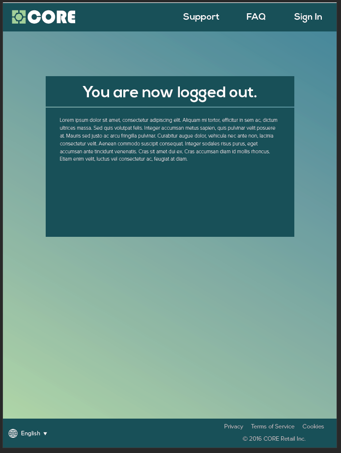
Mobile Low Fidelity
These days, you would be remiss to neglect the mobile side of things. With mobile traffic getting ever more larger, these wireframes had to be translated into layouts that would work within the mobile space. Featured here are the tablet and phone versions of each of the final wireframe selections.


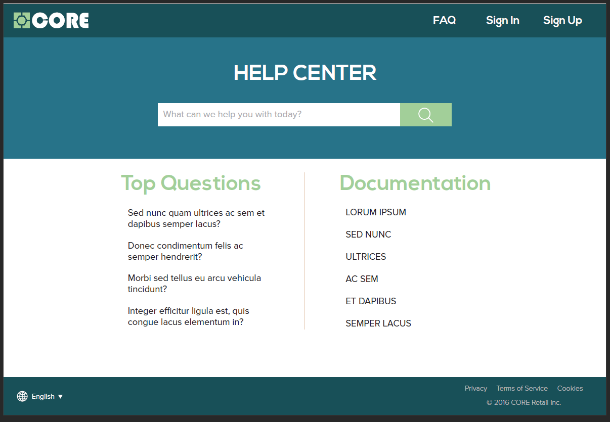
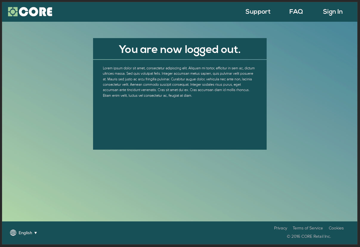
Color Comps
These full color comps are by no means final, nor was the color scheme either. However, it is always useful to eventually create full color versions of your work to see other ways your content and layouts can interact with each other, only now with a new tool in the drawer, color! As always, since there was no body copy generated for the time, I went ahead and filled in text with Lorum Ipsum.