
Lowe’s Accessible Home
Project Purpose
I am under NDA and can only show parts of this project.
The Lowe’s Accessible Home (Livable Home) initiative was a part of a multi-pronged major refresh and rework of the entire sector of “aging in place” of products and services Lowe’s offers. This e-commerce page in particular was the first step in this process and was to be the spearhead for entire project. It was aging not only in its design but also in its ease of use and navigability. My goals for this redesign were to implement the style where appropriate and give it a light and airy feel with more spacing around content sections. Use of relevant and high quality lifestyle imagery helps humanize the shopping experience. It anchors each content section and makes it easy for people to understand where you are on the page and what exactly you are shopping for.
Challenges
Had to spend a month doing UX research and and studying market trends to develop the new Style Guide for the whole department. This involved collaborating with several other design teams.
Once the Style Guide was approved I was given 2 days to update the page and resolve design issues in order for it be consistent with current Lowe’s design principles.
While I had a decent framework to start from, I still had to gut about 90% of the old content as it no longer made sense current day. Image gathering was one of the the longest steps of my design preparation, taking at least 6 hours to track everything down.
Whatever changes I made had to constantly be checked for the mobile version consistency. Since the majority of internet traffic is now done on mobile devices, you cannot afford to offer a sub-optimal experience to mobile users. You can see the old page and screens of the new design below!
Userflows
A period of pre-project research and development went into the making of this page refresh. Acting on heat map data, user feedback, and our own internal analytics, we were able to make basic personas and ascertain the types of users who frequented this category of merchandise. Here are some sample userflows I developed in collaboration with the Lowe’s UX team:
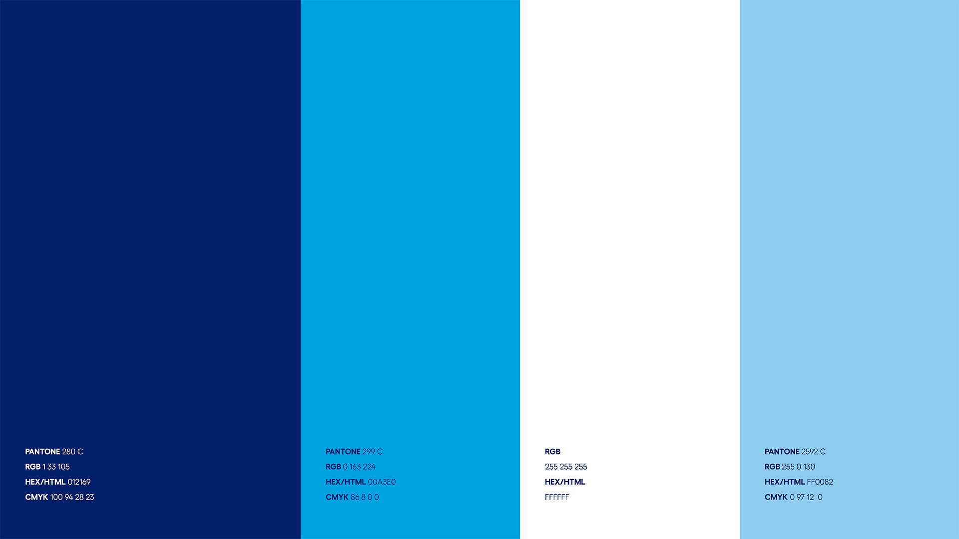
Style Guide - A vision of what could be!
The below images are an abbreviated peek into the style guide (61 pages total) I co-developed for this project. This took a month to research and develop.


Results
The marker for success with this project was to improve the look and feel of our “aging in place” product offerings. Our key target demographic was a more tech-savvy and smart buyer who was assisting a loved one in their elder years. The updated structure, links to educational content on our product offerings, and warm lived-in photography led to a measurable boost in click-through rates to the e-commerce store for Accessible Home. This in turn generated additional sales revenue that was noticeable for the rest of the financial year. (up 19% overall from previous year)
Before redesign
After redesign
Old Version
As you can see below, the old page design felt anemic and barebones. No longer really selling the “feel” we wanted to promote with the style guide from above. Click on any of these for a full-screen view.
Newly Designed Facelift - Desktop
Taking the base of the page and the style guide in hand I went to work after collecting a large amount of new visual assets. My goal was to create a more “lived-in" and “graceful” feel, while also simplifying the options available so as to not create information overload for the user. Since this particular page’s goal is about grouping product in a visually pleasing way, I married the look and feel of the overall Lowe’s website with some of the new improvements from the style guide. Click on any of these for a full screen view.


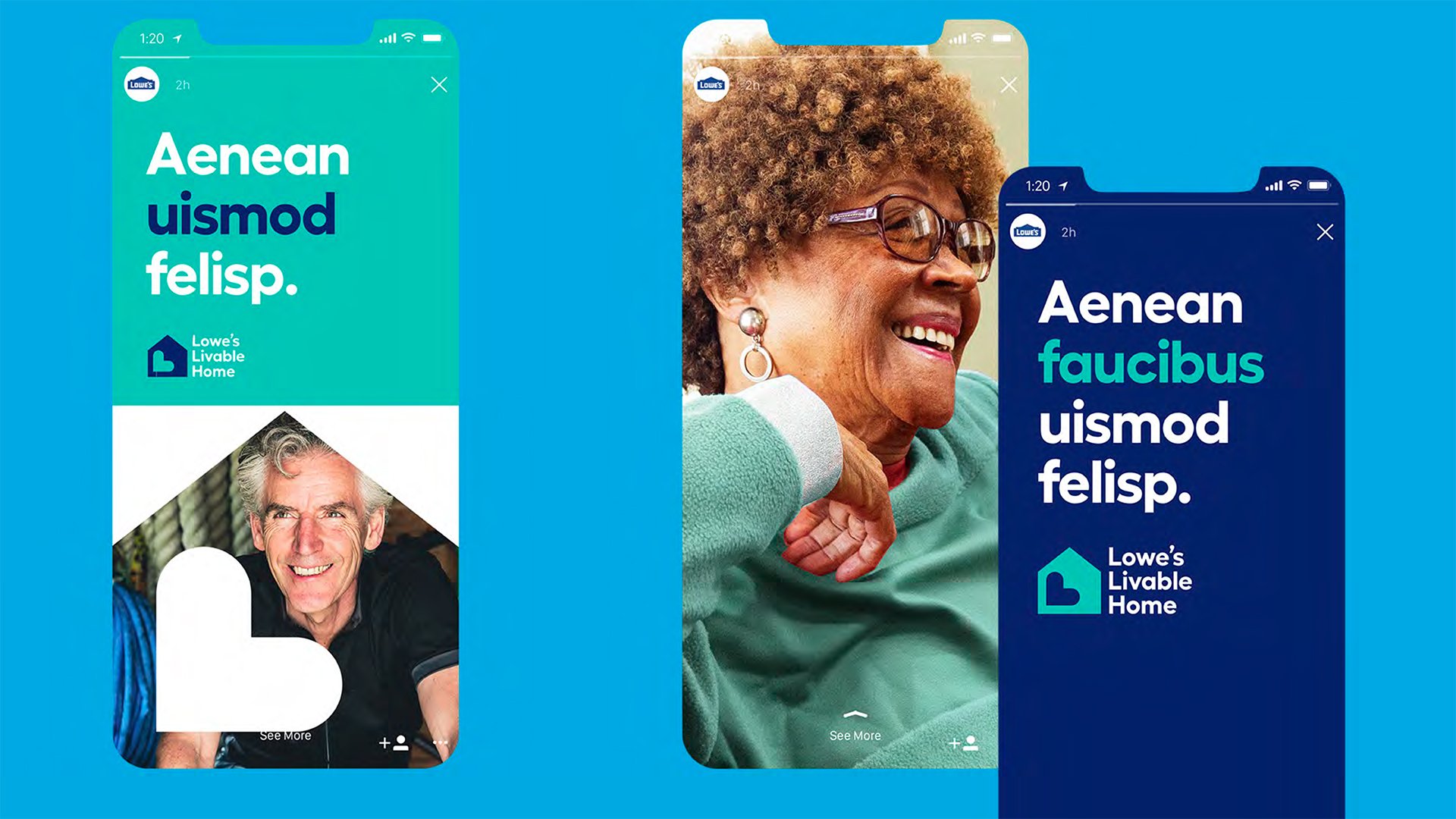
Newly Designed Facelift - Mobile
Every time I would settle on a design choice, I quickly compared that to how it would end up displaying on Mobile. If it didn’t work or felt too busy, I went back to the drawing board. Click on any of these for a full screen view.


Newly Designed Facelift - Full Page View
Click on either the Desktop or Mobile option for a view of the WHOLE thing together!
It really helps to give a sense of scale and just how much content was getting put onto this page.
DESKTOP
MOBILE